Since Presdient Trump got into office, he and his minions have been spouting off at how great the markets are doing under his presidency. Let’s take a closer look, shall we?
Each and every president inherits (among other things) the economy of their predecesor. Along with the economy, they also start their administration under the final budget of the previous president. The new fiscal year doesn’t start until October 1st of the year after their election. That is, for ANY president, the budget and economy don’t really reflect their fiscal policies until about a year after they take office. In the case of President Trump, that’s January 2018, for Obama it was January 2010, for Bush II, January 2002, etc.
Many people view the markets as a proxy for the state of the economy, and President Trump and his supporters definitely take that view. I’ve heard many, Many, MANY times from them something along the lines of “… the economy is going gangbusters, just look at the stock market!”.
So, let’s do just that.
You’ll find below a series of images. Each is a graph of the stock market from January 1st of the first year of a president’s economy (see discussion about fiscal year, etc. above) to December 31st of the last year of a president’s economy. The images are presented in reverse chronological order for the presidencies of Trump (January 2018 – present), Obama, Bush II, Clinton, Bush I, and Reagan.
Trump

- Open: 24809
- Close: 24456
- -1%
Obama

- Open: 10430
- Close: 24719
- +137%
Bush II

- Open: 10021
- Close: 10428
- +4%
Clinton

- Open: 3754
- Close: 10021
- +167%
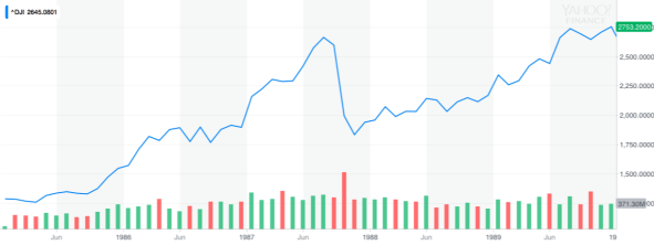
Bush I

- Open: 2748
- Close: 3754
- +37%
Reagan
- Open: 1277
- Close: 2753
- +116%
Apples To Apples
So, comparing apples to apples, we’ll look only at the percentage increase or decrease under each president (with Trump through 6/22/2018).
- Trump: -1%
- Obama: +137%
- Bush II: +4%
- Clinton: +167%
- Bush I: +37%
- Reagan: +116%
What does this mean? Well, at least up until this point, it means that President Trump has been bragging on the economy of the end of Obama’s presidency… because his own economy is nothing to brag about. In fact, something interesting happens if you sort these by percentage (decending):
- Clinton: +167%
- Obama: +137%
- Reagan: +116%
- Bush I: +37%
- Bush II: +4%
- Trump: -1%
Not only does President Trump finish dead last, the Democrats have clearly, and unambiguously handled the economy better than the Republicans have (if you buy into the markets as a proxy for the economy orthodoxy).
BUT, I hear you say, it’s not fair to compare the whole tenure of previous presidents’ economies with only the first six months of President Trump’s, and there’s some truth to that. If we look at the first 6 months of the Obama economy, the results are actually quite similar to President Trump’s:
- Open: 10431
- Close: 10445
- +0%
Basically stagnant. There is one huge difference, however. President Obama was dealing with the fallout of the Great Recession at the time while President Trump inherited an economy that had recovered and was booming (the boom continued throughout the first year of the Trump Presidency, but as I discussed above, that was actually part of Obama’s economony). So while President Obama turned things around after the Great Recession, President Trump has managed to squander much of the healthy economy that he inherited.
Time will tell if the economy will reverse course under President Trump as it did under Obama, but with trade wars looming, tarrifs growing, deficits exploding, health care costs increasing, and gasoline prices rising, it’s hard to see that happening.
